What’s New In DonorQuest 7.7
DonorQuest 7.7 includes quite a few exciting enhancements as outlined below. If you are upgrading from a version of DonorQuest earlier than 7.6 (the previous release), you should also consult the various “What’s New…” documents, available under the, “What Was New In Previous Releases” topic of this User’s Guide. The version of DonorQuest you are currently running is always shown in the upper-left corner of the main DonorQuest window. Here’s an overview of the new features in DonorQuest 7.7: Here’s an overview of the new features in DonorQuest 7.7:
New Graphing Capabilities
The graphing abilities of DonorQuest have been expanded considerably. Now you can graph counts of new Constituent and Memo additions over time, plus detailed count and dollar information for Donations, Pledges, and Contacts. These graphs are available both on the Reports menu, and when the Selection Results window is open. If you wish the graphs to operate on all Constituents, Memos, Donations, Pledges, and Contacts, then launch them from the Reports menu. However, if you wish to graph only the records of a particular Selection Result, start by opening the Selection Results window, highlight the selection you wish to graph, then click the new Graph button you will see on the left side of the Selection Results window. The graphs are particularly flexible when used with a Selection Result, as this allows you to apply any conceivable filter condition to the data table being graphed. For example, you could graph just the donations for a specific campaign by first running a selection to capture those specific donations.
Counts in graphs are shown in amber, and dollar totals in green. For example, here is what the Constituent Counts graph looks like for a typical nonprofit organization adding a few thousands constituents per year:
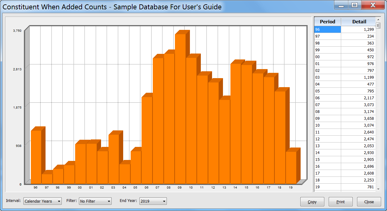
To the right of the graph is a two-column grid showing the exact values from the graph for easy reference. Also notice the drop-down options shown beneath the graph. For the above graph, the Interval option allows you to control the time interval (Calendar Years, Fiscal Years, Months, Weeks, or Days) shown on the horizontal axis of the graph. The Filter option allows you to restrict which constituents are counted for each Interval (you can limit by Year-To-Date, Quarter 1, 2, 3, or 4, or by a specific month within each year). The End Year drop-down simply lets you establish an end point for the horizontal time axis. It defaults to ending at the current year (showing a full 24 years), but moving the endpoint into the past allows you to see any 24-year segment in time. If you choose a small time interval (such as days or weeks), the End Year control will transform to an End Date control, allowing you to choose a specific End Date.
Here is an example of what the new Donation graphs looks like:
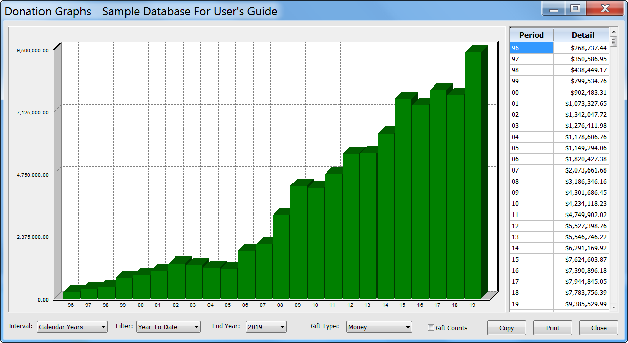
As with the Constituent graphs, there is a two-column grid on the right showing the exact values from the graph for easy reference. There are also drop-down options for Interval, Filter, and End Year. But in addition the Donation graph has options for the Gift Type (Money or non-monetary types such as volunteer hours), and a checkbox for seeing gift counts as opposed to totals. In the above example, we have the Filter option set to Year-To-Date, so the yearly totals reflect total donations for the current date (month and day) for each year.
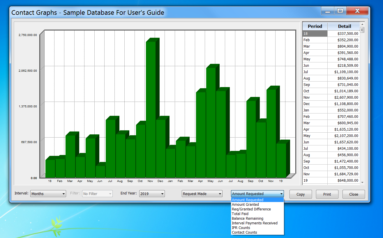
The Contact graphs also share the basic Interval, Filter, and End Year options, but they also have two special options for viewing financial grant-oriented contacts. Here is an example of a contact graph showing dollar totals, by month, of all the grant request amounts made:
All graphs also include Copy and Print buttons. The Copy button allows you to copy the entire graph to your computer’s copy/paste area so that you may paste the graph into Word documents, Excel, EMails, etc. The Print button simply prints the currently displayed graph on your printer. There’s a whole lot more to the new graphing capabilities in DonorQuest than is shown in this upgrade overview, so consult the main User’s Guide for more details and most importantly feel free to open the graphs under Reports, Graphs, and just experiment!
New Dashboard Display
The new DonorQuest Dashboard offers a live view of what’s going on in your donor database from minute to minute. All of the displays within the dashboard are updated in realtime, so you may simply leave it open to continuously monitor the information which most interests you. The dashboard can be kept open along with other DonorQuest windows, allowing you to do your normal activities in DonorQuest while still monitoring events. It can also be resized to suit your preferences and to fit nicely with whatever else you may have open in DonorQuest. Any preference changes you make to the dashboard will be saved under your user account, allowing you to have your own customized dashboard. The dashboard display consists of grids and graphs. Some are donor-specific, and others are more statistical in nature, showing realtime totals across many donors. You may open the DonorQuest Dashboard at anytime by clicking the icon for it on the DonorQuest toolbar, which looks like this:

Here is a brief overview of the various displays within the dashboard:
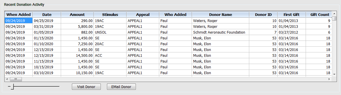
Recent Donation Activity
The Recent Donation Activity display is a running track of donations as they are entered. If you have multiple data entry people at work entering (or importing) donations, you will see them here as they hit the database. Below the grid are some controls – a horizontal slider to control the font size of the grid, and a couple buttons. The Visit Donor button will automatically position you at the donor’s record in the main data windows so that you can see full details about any of the donors who just had a donation added. The dashboard window will stay open alongside the main data windows so that they may be used in combination. There is also an Email Donor button which will allow you to compose and send an email right on the spot to a donor if you wish. If you are a campaign manager and you happen to know a donor who just gave a large gift, you could thank them immediately and personally! In total, the Recent Donation Activity grid has the following columns: When Added (actual date donation added), Date (date assigned to donation), Amount, Stimulus, Appeal, Who Added, Donor Name, Donor ID, First Gift, Gift Count (lifetime), Life Total, Address, City, State, Zip, Phone, Primary Email, Donor Type, Fund (for donation), Type, Account, Thank-You Letter, and Comment. Here is what the Recent Donation Activity display looks like:
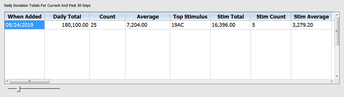
Daily Donation Totals For Current And Past 30 Days
This dashboard display is intended to give you a summary of daily revenues for the current and past 30 days. It provides a quick way to get a handle on your day-to-day entry volume and revenues. It shows a daily total, gift count, and average by actual entry date (not the given donation date, though they are typically the same). Also shown is the top stimulus for each day by revenue, along with a gift count and average amount for the top stimulus. Here is what the display looks like:
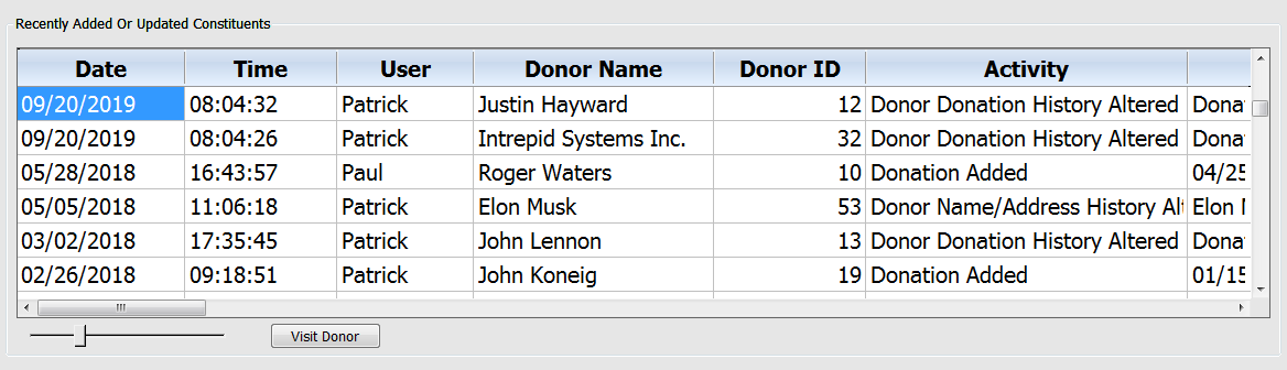
Recently Added Or Updated Constituents
This dashboard display will show you all user actions affecting constituent records in realtime as they happen. If you need to investigate an event in more detail, simply click on the Visit Donor button. Here is what the display looks like:
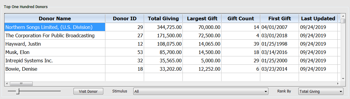
Top One Hundred Donors
Initially this dashboard display will show you your top 100 donors based on lifetime giving. But using the Stimulus selector, you can monitor your top 100 donors for a specific stimulus code. There’s also a Rank By selector which allows you to choose between Total Giving and Largest Single Gift. This is used in combination with the Stimulus selector to filter the donors who makes it into your top ten list. You may also order the display by any column by clicking on the title for the column you wish to order on. Clicking repeatedly will toggle between ascending and descending order. There is also a Visit Donor button which you may use to view all information about a specific donor via the DonorQuest Main Information windows, which can be open at the same time as the dashboard, working together to keep all information at your fingertips. Here is what the Top One Hundred Donors display looks like:
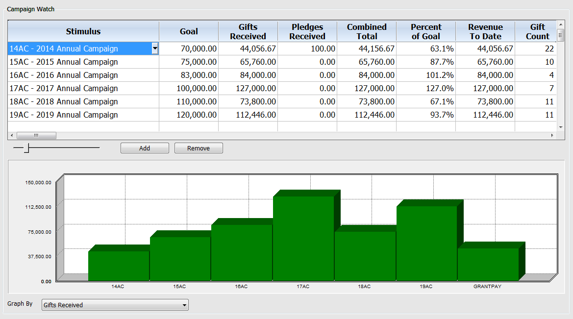
Campaign Watch
The Campaign Watch is a combined grid and graph display showing campaign (stimulus) totals. Note that campaigns are driven by stimulus codes in DonorQuest, and there is normally a one-to-one correspondence (so when you see Stimulus, just think Campaign). The graph is linked to the grid so that any changes you make to your preferences in the grid are immediately reflected in the graph, including when you order the grid in ascending or descending order by any of the columns. You may use the Add and Remove buttons to add or remove rows from the grid, and the drop-down arrow in the stimulus column can be used to change the stimulus being monitored. After adding a new row, you need to select the Stimulus it should display information for. Directly below the Campaign Watch grid is the companion graph, showing totals by Stimulus. The horizontal axis of this graph will always show all chosen Stimulus codes from the grid, but you may control the vertical axis via the drop-down control you will see beneath the graph. This control will let you graph by any of the numeric columns of the grid for each Stimulus. Specifically you may choose to graph by Goal, Gifts Received, Pledges Received, Combined Total, Percent of Goal (achieved), Revenue To Date, Gift Count, Average Gift, Pledge Count, Average Pledge, Combined Count, and Combined Average.
Feel free to customize the display as much as you like since all changes are saved under your user account. This allows all DonorQuest users to have their own custom viewing preferences for all dashboard displays without interfering with the preferences of other users. Here is what the Campaign Watch display looks like:
Appeal Watch
This Appeal Watch display within the dashboard is just like the Campaign Watch display, but deals with Appeals instead. Otherwise it has the same grid columns, corresponding graph, and functionality.
Support For Custom Pledge Payment Scheduling
Up to now the DonorQuest pledge payment system (and associated reminder statement reports) required regular pledge payments of equal amounts. It was based on monthly, quarterly, semester, or annual payments for each pledge. A donor could proactively pay more than was due in a payment period, and that would correctly adjust the remaining balance of a pledge on reminder statements, but the payment schedule itself would not change – the donor would simply be “ahead” of it. Now in DonorQuest 7.7, you may schedule pledge payments down to the day for any amount. All that’s required is that the sum of the payments add up to the total amount pledged, within the Start and Stop date range of the pledge. This new scheduling is optional, and any existing pledges you have will continue to be serviced normally with our invoicing statements. The new Payment Schedule is an optional feature you may now use with pledges as needed to accommodate any custom payment requirements a donor may have.
In the following example, we have a basic pledge which spans a year using quarterly payments. Since the pledge is for $1,200, the donor would normally be sent a reminder to pay $300 at the start of each quarter, and that’s the only option you had previously. However, in this example the donor has asked that his first pledge payment be $500, his second $100, and the remaining two $300 each. Here is what his payment schedule would look like:
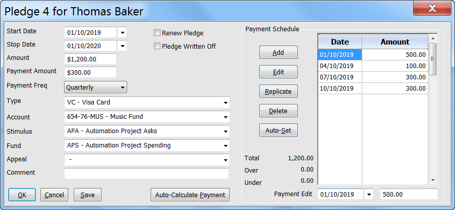
We could also have accommodated irregular payment dates in the above example, or even more than four payments. All that really matters are that the Start/End Dates, and the sum of payments equals the total amount pledged. The Payment Frequency now acts simply as a guideline for initializing the schedule of payments when you click on the “Auto-Set” button inside the Payment Schedule. There is also a new stock report layout named, “Pledge Statements: For Scheduled Payment Pledges” designed to be used universally for all pledges with a payment schedule. This single stock pledge statement report essentially replaces the series of statement reports we have which are based on calculating a payment due amount based on Payment Frequency and Start/Stop dates. However, the older statement reports will be kept in DonorQuest for backwards compatibility. Going forwards you should use the “Auto-Set” button to set a payment schedule when creating a new pledge, and then make manual changes to the schedule only as needed. This will allow the single universal reminder statement we now have to work for all of your pledges.
Automatic Tiling Of Main Windows
Historically DonorQuest has allowed users to open, position, and resize data windows, and DonorQuest simply remembered each user’s preferences, opening windows again to the same state they were last in when closed. Of course DonorQuest will still do this if you wish, but now there is a new Personal Settings option called Automatic Tiling. This optional feature can be used to have DonorQuest automatically resize and position data windows as you open and close them, always making optimal use of available screen space within the main DonorQuest program window. This is particularly helpful if you use DonorQuest on multiple workstations with different screen resolutions. You can access the available automatic tiling settings by clicking on User, Change Your Personal Settings. You will see the new option at the bottom of the Personal Settings dialog, as shown here:
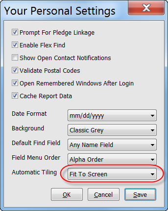
When first trying this option, use the, “Fit To Screen” setting, as shown above. This will arrange windows vertically, making optimal use of screen space each time you open or close a window. For example, if you open only the main name/address window, it will fill the DonorQuest program window. If you then open the Donations window, the two open windows will each take half of the available space. Opening a third window will divide the space in thirds, and so on. As you close windows, the process is reversed, automatically allowing the remaining open windows to reclaim optimal equal space. Of course any changes to column widths and positions you have made within data windows will still be preserved just as they always have. It is only the window sizes and positions which are automatically changed. Give it a try!
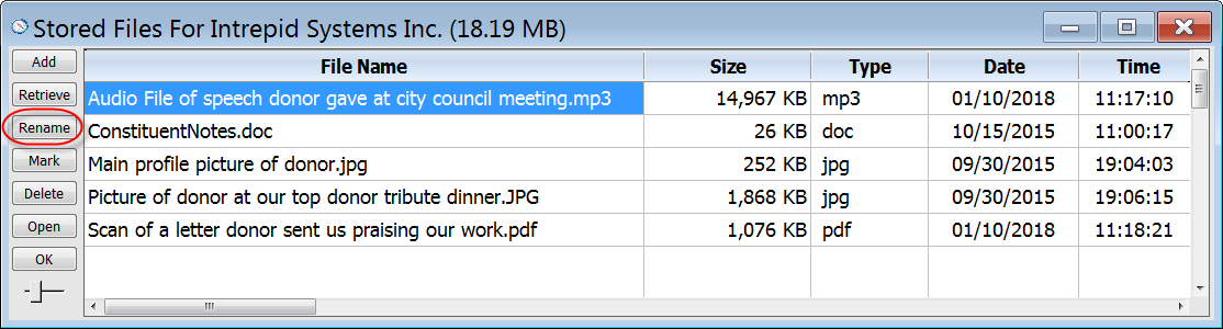
Rename Button Added To Stored Files Window
DonorQuest can store files of any type in a donor’s account, such as audio files, picture files, or PDF’s. The list of stored files for each donor can be accesses by clicking on the Files icon on the DonorQuest Toolbar. Previously there was no way to rename a file once it had been stored (other than retrieving it, renaming it in a folder on your computer, deleting the original, and adding back the renamed file). Now there’s a new Rename button in the Stored Files window, as shown here:
Move Button Added To Donations, Pledges, Contacts
Mistakes happen and sometimes a donation, pledge or contact gets added to the wrong donor account. Previously you would have to delete the incorrect entry and re-enter it. Now with the new Move button you can easily correct such an entry. Simply highlight the donation, pledge, or contact which needs to be moved and click the Move button. DonorQuest will then allow you to interactively search for the correct donor account, and offer a final confirmation before completing the move. When searching for the correct account, you may search by any column of the Main Information Window, including names, addresses, email addresses, etc.
Real-Time Updates For DonorQuest Event Log
DonorQuest stores detailed tracking information for the activities of all users. Everything from when each user logged in, to when they logged out is chronicled. The DonorQuest Event Log, accessed by clicking on File, Open, The Event Log, has always been a valuable resource for administrators to monitor activity in a multi-user environment. Now, whenever the highlight is left positioned on the first row of the Event Log window, new events will automatically be added as they occur, scrolling older events down in the display grid. If you have a number of users all doing things at the same time in DonorQuest, it can actually be very informative (as well as entertaining) to just sit back and watch all the activity just roll into the log as it happens.